


Microsoft Access is a two-fold blessing for programmers. In addition to being a fantastic development platform, its wide popularity as an office productivity tool helps to sustain a market for end user data reporting utilities. Savvy developers know how to cash in on this opportunity by writing focused applications with a clear objective in mind. Does Visual Access XP meet this litmus test? Read on and see.
The author of Visual Access XP, Jonathan Hettena, has stumbled onto a great concept that, in my opinion, fills a niche in the Access tools market. The idea behind this utility is to encapsulate and simplify the steps required to bring data together from various sources, create the necessary SQL to return a recordset and finally transform the data into a pivot chart, graph or an OLAP cube. A quick look at the Visual Access Command Center in Figure 1 gives you an idea of how the user is progressively walked through the process from data selection to presentation output.
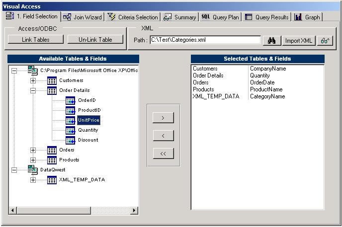
Figure 1
Although I have high praise for this utility, there are some user interface issues that need to be addressed. Doing so will hopefully have multiple benefits. First, I believe that implementing the suggestions contained in this article will make Visual Access XP a first class reporting tool. Second, these issues are the kind that should be of interest to all Windows application developers, but are seldom discussed. And finally, along the way, you will be introduced to a product that may be just right to fill a reporting need for you and/or your clients.
Walking Through the Process
The first thing I do with a new product I’m reviewing is launch the application and try to walk through it without having read any help files. I’m always impressed when a program is so intuitive that I can figure it out just by running it. As I “click” my way through the program, I pay special attention to the controls and the layout of the user interface, and I make note of “features” that irritate me. This is not for the purpose of trashing someone else’s work. I scrutinize the user interface in my own software with the same vigor. It’s actually a good habit to get into while developing your applications since regular and consistent UI evaluation will improve the quality of the product you deliver.
Visual Access XP was very intuitive to me as a developer. The first tab of the command center, shown in Figure 1, does one thing, one step, and it does it well. You can add linked data sources to the list of tables on the left, whether they are from an Access database, SQL Server or XML files. Once added to the list, they are all treated as homogeneous data. The interface then allows you to select the fields you want to work with.
The next logical step is handled on the second tab of the command center. There you can assign primary-key to foreign-key joins for your data sources. The process is easy, requiring users to simply make selections from drop down boxes for left table and field, right table and field and join type. The user need not understand relational theory, only the idea that, for example, the Customer table is related to the Order table through the CustomerID, which appears in both tables.
The next tab allows users to select criteria for filters, sorting and aggregates (See Figure 2). Once again, as a developer selecting filter criteria makes perfect sense to me, but I’m beginning to wonder if someone less experienced with Microsoft Access will understand what to do here. Also, there are some limitations to the kind of SQL that this criteria selection page can produce. My example shows that I’m adding the aggregate sum of the [Quantity] field of the [Order Details] table, when what I really want is the sum of Quantity*UnitPrice. More about that later.
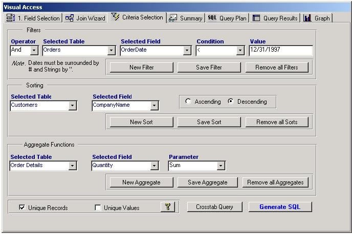
Figure 2
Notice that in Figure 2 I set a filter criterion to return only those orders with an OrderDate less than 12/31/1997, but when I try to execute the SQL I’ll find out that I’ve made a mistake here. As a developer, I know that Access requires the pound sign (#) as a date delimiter and that I should have entered my criterion value as #12/31/1997#. Looking back, I now see a note in the UI that says dates should be surrounded by # and strings by quotes, but this is one case where the program could have compensated for my error. And for that matter, although any developer would probably know what a “string” is, not all of my clients would. This is an example of how we need to keep our applications focused with a clear objective. If our target audience includes non-developers, the user interface should accommodate them.
For this particular example, it’s easy enough to add code to automatically correct the user’s omission of field delimiters. The following code could be used to handle data types for this kind of criteria field:
Dim varValue As Variant, strOut As String
  varValue = Me!txtValue
  If IsNull(varValue) Then
    ' Ask user for input value
    Exit Sub
  ElseIf IsDate(varValue) Then
    strOut = "#" & varValue & "#"
  ElseIf IsNumeric(varValue) Then
    strOut = varValue
  Else
    strOut = "'" & varValue & "'"
  End If
Another thing I didn’t like about the design of this page is that, in order to get any data out, you have to press the Generate SQL button at the bottom of the page, but this button doesn’t generate results. It only populates the text box on the SQL Query Plan tab with the SQL that will be used to output data. There’s nothing wrong with having the button (in a sort of “belt and suspenders” kind of way), but I think that the new SQL statement should be generated automatically each time the SQL Query Plan tab is made active. It wouldn’t be that hard to code, and it would avoid user irritation when they are forced to return to the Criteria Selection tab to click on the button, as I did so many times.
One thing I did like was that, once in the SQL Query Plan window, you can edit the SQL to meet your needs. In Figure 3 I have highlighted a couple of things I changed. Since I noticed that the date criteria were missing the pound sign delimiters, I simply typed them in at this screen. I also changed my aggregate, Sum([Quantity]) to Sum([Quantity]*[Price]) and set its alias to Total. From this screen, you can save your query, save the resulting dataset for later use or execute the results into the Query Results tab page (See Figure 3). As an aside, the SQL generated by Visual Access XP was not neatly formatted, as it is in my screen shot. I like well arranged SQL, so I manually added the white space shown, but it wouldn’t be a huge ordeal to run the resulting SQL through a formatter before presenting it to the user. I think such code comes in one of the samples installed with SQL Server, and I also provide a free tool for formatting SQL at my web site, http://datafast.cjb.net.
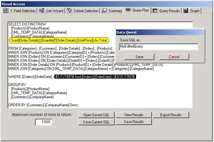
Figure 3
Of course, there is a slight irony in all of this. If the user knows how to type SQL into a text editor for proper execution, then the user really didn’t need the first three pages of this “wizard”. This emphasizes one of my biggest issues with Visual Access XP. As I questioned above, who makes up its target audience? Developers or casual users? Up to this point in the process, I haven’t seen anything of value to me personally as a developer. I prefer writing SQL directly into the query window. As for casual users, such as some of my clients, I fear it’s possible that they don’t understand enough about relational database design, joins, aggregates and criteria restrictions to have successfully made it this far. I have more to say on this issue a bit later, but let’s finish the process first.
After having saved the results set, you can now display the data or process it into a pivot chart, OLAP cube or graph. If the user prefers to work in Excel, there’s a button named Pivot (Excel), which uses automation to open an Excel spreadsheet, insert the data and invoke the Excel pivot table interface. Alternatively, the raw data may simply be exported using any number of formats, including XML. If you remembered to save the result set while in the Query Plan window, the data exists in a local Access table, which can then be opened and browsed as a standard Access table. There’s also a button that exposes a really cool feature of Access 2002, namely Pivot Table view and Pivot Chart view for Access tables (See Figure 4). Finally, there is a Graph tab in the command center that, I would expect, displays the data in a chart object on the form. Unfortunately, this feature is either not enabled in my version, or is not yet ready for shipping.
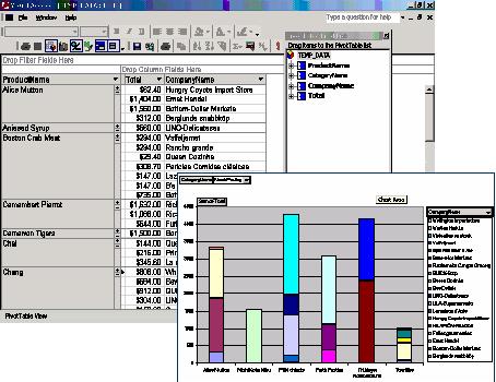
Figure 4
Lessons Learned About Keeping Focus
When I began this article, I promised to raise some issues that should be of importance to all Windows application developers. Throughout this review, I’ve alluded to those issues, but in order to be clear about what I had in mind, let me briefly review some of the things that I believe help make a product successful.
Focus, focus, focus. There’s an old saying that if you try to please everyone, you will end up pleasing no one. Take some time to figure out who the target user is for your application. Write it on a sticky note and paste it to your monitor. Think about that user each time you write a business rule or modify an interface. Visual Access XP is a great concept built on what has to be some very cool code, which, quite frankly, I wish I could get a look at! What would make Visual Access XP more marketable, in my opinion, is if it were redesigned somewhat to better accommodate novice users. In fact, I have a client who would love to be able to work with the OLAP and Pivot charts, but I don’t think he could generate what he wants without help from me, which means more hours of phone support time at the DataFast help desk. I don’t like that prospect.
The second issue isn’t mentioned much in the article because it deals with user interface issues that Jonathan Hettena dealt with prior to my writing this article. I’m a stickler for following GUI standards (there are many good books on the subject) and deviations from the norm really bug me. For example, I asked Jonathan to change the back color of the SQL Query Plan text box from gray to white because it’s a field that users can edit. Editable boxes have a white background color as a rule, and users are accustomed to this convention. This concept of standards applies to all form controls, and if you’re not sure how a control should be used, study any of the standard Microsoft interface forms and take note of things such as color and size, as well as the type of control used to accomplish a given task.
The final issue has to do with process flow. Another thing Jonathan modified at my request was reducing the number of message boxes that pop up. For example, when saving a table join, the user has to click the Save Join button. Prior to modification, a message box would appear, asking the user if he wanted to save the join and another appeared to confirm the save. The first message box no longer appears, which is great, but it’s possible to remove the confirmation as well. Let the user assume that all is well, unless an error occurs. To provide a visual indication that the process is complete, you can simply clear the text boxes and/or disable the Save button. Also, as I mentioned above, some processes can and should be automatic, such as updating the SQL in the Query Plan window when it becomes active. Another example of this would be generating the recordset automatically when the Query Results tab is clicked.
The above suggestions are based in part on my personal opinion, and in part on well-documented GUI standards. Maybe I’m too picky, but if you’re trying to create that “killer app”, you sometimes have to suppress your more creative, artistic side and follow the crowd. After all, it’s the crowd who will be buying your product.
The Verdict
Visual Access XP is going to be a great product that will fill a niche for some customers. Bringing data together from different sources and reporting with OLAP and Pivot Charts is a valuable service that can be intimidating for the uninitiated. At a list price of $209 for a single user license, it’s more expensive than other Access utilities on the market, but if you have a client who needs this ability, it would be cheaper than paying consultant fees for ad-hoc chart reports. Even if the above-mentioned suggestions don’t find their way into the next release, it may still be the right reporting tool for your clients. You can read more about Visual Access XP and other utilities at the DataQwest web site, http://www.dqwest.com/.
This article originally appeared in the Smart Access Newsletter, Pinnacle Publishing, Inc. (c) All rights reserved.