


In this
four-part tutorial, you will learn how to use NT Server 4.0’s
Performance Monitor and Microsoft Excel to monitor and analyze
SQL Server performance. You will also learn how to use a SQL
Server database to store your Performance Monitor logs. This
tutorial assumes that you already know the basics of using
Performance Monitor, Microsoft Excel, and of course, SQL Server.
This is part
three of a four-part tutorial. This part discusses how to use
Microsoft Excel to create analysis charts and how to perform
trend analysis using Performance Monitor data. Part four
will show you how to interpret your results. Read
part one. Read
part two.
This
article uses Microsoft Excel 97 for its examples. If you have
Microsoft Excel 2000 instead, you should be able to follow along
with few, if any changes.
Introduction
While the Chart
Mode of the Performance Monitor is not too bad a tool to
visually analyze Performance Monitor results, it has a lot of
limitations. Some of these limitations include the inability to
easily manipulate the data, to analyze the data using various
statistical functions, or to project the data into the future to
help you predict future SQL Server resource needs.
To
make the job of analyzing and interpreting Performance Monitor
data easier, we are going to learn how to use Microsoft Excel to
perform this task. The focus of this article is on how to use
Microsoft Excel to create charts and how to perform trend
analysis using Performance Monitor data, not how to
interpret the results. That will be covered in part four of this
four-part tutorial.
Before
I begin, I’ll just come out and say it, analyzing Performance
Monitor data with Microsoft Excel is not the most elegant
approach I have seen to analyzing data. It requires more manual
work than I prefer, and it doesn’t easily provide all the
analysis I would like. But given my budget, and most DBA’s
budgets, you may not be able to afford a better tool. I would
prefer a tool dedicated to collecting and analyzing Performance
Monitor data, but until then, I’ll have to settle
for Microsoft Excel.
In
the following sections you will learn the basics of how to use
Microsoft Excel to create charts and how to perform trend
analysis using Performance Monitor data. In order to follow this article, you
should have a basic understanding of how to use Microsoft Excel.
Where
to Start
Before you can
start analyzing Performance Monitor data using Microsoft Excel,
you must first answer these important questions:
Where
to get the data from?
If
you have followed this series of articles, then you would know
that I have previously suggested that you store your SQL Server
Performance Monitor data in a SQL Server table. Storing your
Performance Monitor data in SQL Server makes it convenient to
store and manipulate your data. For example, you can create
separate tables for each of the SQL Servers you want to monitor.
And as you gather more data, you can append the data to the
table, allowing you to store all of your historical data in one
central location. You can also use queries to select only that
data you want to export to Microsoft Excel.
Of
course, you don’t need to store your data in SQL Server in order
to analyze it with Microsoft Excel. You can store Performance
Monitor data in several formats, including native Performance
Monitor files, ASCII files, in a Microsoft Access database, or
any database for that matter.
No
matter where you store your Performance Monitor data, you will
need to select a location and use it as your central repository.
It is important that all your data be handily available, and in
a format easily accessible by Microsoft Excel.
Which
counters do you want to analyze?
Most
likely, you have collected more counters than you want to
analyze. What you will want to do is select only a small handful
of counters to analyze at any one time in Microsoft Excel. This
is because putting too much data on the screen in Microsoft
Excel makes it difficult to see what you are doing (the screen
just gets too confusing). If
you need to analyze more data than can comfortably fit on the
screen, then you can analyze the data in groups of related
counters. The actual number of counters you should analyze at
any one time depends on your screen resolution (how much you can
see on your screen) and how much data you are comfortable working
with.
For
this article, I am going to assume you know what counters you
want to analyze, so I won’t mention specific ones at this time,
although later you will see some examples I commonly use. But in
part four of my series on Performance Monitor, I will discuss
specific counters and what to look for.
What
time period do you want to analyze?
Generally,
there are three different time periods you will want to analyze:
daily, monthly, and quarterly. Of course you can choose any time
periods you want, but I find these three time frames useful for
different reasons.
Daily:
A daily look lets me see what is happening on an per-hour basis,
looking for daily patterns, peak times, and lull times. I am
also looking for counters that indicate bottlenecks. When I am
performance tuning for specific bottlenecks, I use daily data
the most. I also use daily data to give me a look at how well
balanced my hardware is, such as how well CPUs and physical disk
arrays are being equally used. In some cases, I will look at even at a range of a
couple of hours if I am trying to diagnose a specific
performance problem.
Monthly:
On a monthly basis, I am also looking for patterns, peak times, and
lull times. Often, I can use the data to help me schedule
database maintenance, such as indexing a database or running
large DTS imports or exports. I don’t usually use monthly data
for bottleneck troubleshooting because the data is not granular
enough.
Quarterly:
I use long term data for trend analysis, to help me
"predict" future needs. For example, I want to predict
how many users will be using my databases, how much physical
disk space will I need, how much I/O capacity I will need, how
much network bandwidth I will need, and so on. The more data you
have here, the better your "predictions" will be.
What
time sampling do you want to use?
As
you probably know, when you use Performance Monitor to collect
counter data, you can select how often data is collected. You
will want to collect it often enough in order to get enough
detail for daily-type analysis, but you don’t want to have so
much data that quarterly trend analysis gets bogged down.
To
get around this problem, you will want to collect data at a time
interval detailed enough for daily analysis, but when you want
to do monthly or quarterly analysis, you will want to aggregate
it so that there is not too much data. And this is where storing
your data on SQL Server comes in handy.
For example, say you
collect counter data every minute, and that you store this data
in a SQL Server table. If you want to analyze daily data, you
can select the time period you want to analyze and export it
from SQL Server as is. But if you want to analyze data on a
quarterly basis, you can use Transact-SQL to aggregate the data
into hourly averages, and then export these to SQL Server. If
you don’t want to aggregate your data using SQL Server, you can
do so using a Microsoft Excel pivot table, as we will learn
later in this article. You
may have to experiment with different levels of granularity
until you find the ones best for the types of analysis you
want to perform.
What
scale do you want to use?
Another
issue you must address is what scale does each of the counters
you want to analyze use. As you may know, some counters use a
percent range, such as from 0% through 100%. Others use a
quantity measurement, which can range from 0 through 10, or from
1 through 1,000,000. Scale is important because it is hard to
analyze data that has significantly different scales at the same
time. Generally,
you will only want to analyze groups of data that have similar
scales.
If
you need to analyze data that has different scales, one option
is to use either SQL Server or Microsoft Excel to rescale the data so that
all of the data fits the same scale. You may remember that the
Performance Monitor Graph Mode does this automatically. If you
do choose to rescale data, be careful to remember this, because
once you begin analyzing data, it is easy to forget that you
have rescaled the data, and you may misinterpret the resulting
charts.
Don’t discount the importance
of finding the best answers to these very basic questions before
you begin analyzing your Performance Monitor data in Microsoft
Excel, as
they will greatly affect the success of your analysis. Once
you answer all of the above questions, you are now ready to
import your data into Microsoft Excel.
How
to Import SQL Server Data Into Microsoft Excel
As I mentioned
earlier, there are many different ways to store your Performance
Monitor data. For this article, I am going to assume that it is
stored using SQL Server. If you are not storing your data in SQL
Server, then you will have to export your data in a format that
can be easily imported by Microsoft Excel.
The
easiest way to export Performance Monitor data from SQL Server
to Microsoft Excel is to use the DTS Export Wizard, although this is not
the only option. The DTS Export Wizard is handy because it steps
you the process of exporting your data from SQL Server directly
into a Microsoft Excel spreadsheet format. For the most part, you just
need to following the screens to find out what to do. But if you
are not familiar with this wizard, here are the basic steps:
-
Using
Enterprise Manager, right-click on the database that
contains the data you want to export, the left-click on
"All Tasks", and then left-click on "Export
Data". This brings up the DTS Export Wizard.
-
Click
"Next" on the DTS Export Wizard introductory
screen.
-
In the
"Choose a Data Source" screen, the
"Source", "Server" name and
"Database" name should already be correctly
selected. If not, then select the correct options. Click "Next" to
continue.
-
In the
"Choose a Destination" screen, The
"Destination" option needs to be changed to
"Microsoft Excel 8.0" (works for Excel 97 and
2000). In the "File Name" option, enter a path and
file name for the Microsoft Excel file that will be
exported. Click "Next" to
continue.
-
In the
"Specify Table Copy or Query" screen, you must
make a decision on what data you want to export. If you want
to export all of your data (which would be unlikely in most
cases) you would select the "Copy table(s) from the
source database" option, which lets you select one or
more entire tables to export to Microsoft Excel. Instead, you
will probably want to select the "Use a query to
specify the data to transfer" option, as this one
allows you to selectively choose what data you want to
export
from your SQL Server table to your Microsoft Excel spreadsheet. Once
you have made your choice, click "Next" to
continue.
-
Assuming you
selected the "Use a query to specify the data to
transfer" option in the previous step, the "Type SQL Statement" screen
is displayed next, offering you two ways to
enter a query in order to specify which data you want to
export. The easiest way is to use the "Query
Builder", which allows you to point-and-click to create
a simple query to select your data you want to export to
Microsoft Excel. But if your query
is complicated, such as you want to aggregate the data
before you export it, you
will have to enter the SELECT statement manually in the
"Query Statement" window. If you do this, I would
recommend you write your SELECT statement using the
Query Analyzer first, as using Query Analyzer makes writing
and debugging the query much easier. Once the query is debugged, you can cut and paste it into
the "Query Statement" window. Once you have
entered a query (however you created it), click on
"Next" to continue.
-
In the
"Select Source Tables" screen, you have the option
to perform column mapping and transformations on the data. In most cases you will probably not need to do
this, but it is available for advanced users. Let’s assume
you don’t need this option, so click on "Next" to
continue.
-
You have now
completed the DTS Export Wizard. At this point you can run
the export immediately, or you can save it, or you can
do both at the same time. If you plan on performing this
same task over and over, you may want to save it as a DTS
package. That way, you can edit the DTS package if you need
to make any changes before the next time you use it. Let’s
assume for now that we want to save this DTS package as a
SQL Server object, so select this option and click on
"Next".
-
In the
"Save DTS Package" screen, enter a name for this
DTS package and click on "Next".
-
The
"Completing the DTS Wizard" screen appears. To run
the DTS package, click on "Finish".
The DTS package
should now run, and after several seconds, display a message
telling you that it was successful. Click on the "OK"
button to continue.
Now that the data
you selected from SQL Server has been exported to an Excel
spreadsheet, you are ready to start analyzing the data
graphically.
How
to Graph Performance Monitor Data in Microsoft Excel
While there are
many different ways to analyze Performance Monitor data, there
is one key approach, and you should already be familiar with it.
This approach is to analyze the relationship between one or more
Performance Monitor counters with time as the dependant factor.
This is where you plot time on the x-axis (horizontal axis) and
the counter data on the y-axis (vertical axis). This method of
analysis is important because our overriding goal here is to
improve performance. And boosting performance is just another
way of saying you want to accomplish more in the same amount of
time. This is why time is our dependent factor. When we analyze
Performance Monitor counters, what we want to see is how they
vary over time.
The
easiest way to analyze Performance Monitor counters over time is
to visually analyze the data using graphs, much like how you
using the Graph Mode of Performance Monitor. The advantage of
Excel over Performance Monitor’s Graph Mode is that it is much
more flexible, helping you to better visualize and analyze your
data.
Once
the Performance Monitor counters (for the time range you
are analyzing) have been imported into
Microsoft Excel
from SQL Server, you are ready to begin graphing and analyzing
your data.
While
there are many different ways to graph data in Microsoft Excel, we will
use the Microsoft Excel Chart Wizard to perform our analysis.
Let’s
assume our Microsoft Excel spreadsheet looks like the one below. Note that
I am graphing 15 second intervals over a period of a couple of
hours. We will look at longer term analysis in the next section.
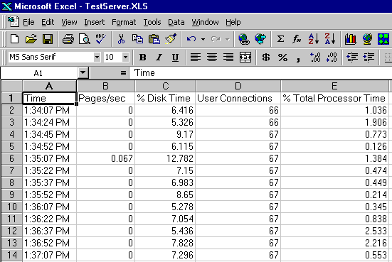
Assuming
that the spreadsheet’s rows represent time intervals and the spreadsheet’s
columns represent specific Performance Monitor counters, we can
follow these steps to create Performance Monitor counter
analysis charts using the Microsoft Excel Chart Wizard.
-
The first
step, before actually starting the Microsoft Excel Chart Wizard, is to
select all the data you want to graph at this time. In my
case, I am selecting all the cells starting from cell A1 to
cell E200. You can select as few, or as much data as you
want when creating your graphs. It is important that the
column names be directly above the data as seen in the above
figure.
-
Now that you
have selected all of the data you want to analyze, the next
step is to start the Microsoft Excel Chart Wizard by selecting
Insert|Chart from the drop-down menu.
-
Step 1 of the
Microsoft Chart Wizard asks you to select the "Chart Type"
you want to create. You have many choices, but the most
common chart for analyzing time-based data is to select a
line "Chart Type". Once you select a "Chart
Type", you next need to select a "Chart
sub-type". You can choose any sub-type you find most
useful, but generally, I pick the simplest one, in this
case, the "Line", as it is easier to interpret.
Once you have made your "Chart Type" and
"Chart sub-type" choices, click on
"Next" to continue.
-
Step 2 of the
Microsoft
Chart Wizard allows you to change the "Data range"
(the cells being graphed) and the "Series in"
(tells Excel if the Performance Monitor data is in columns
or rows). Assuming your data looks like the above
illustration, and you selected all the cell containing the data
before you started the Chart Wizard, then no changes have to
be made to this screen. Click on "Next" to
continue.
-
Step 3 of the
Microsoft
Chart Wizard allows you to "dress up" the chart.
Note that at the top of this screen are a variety of tabs.
Feel free to experiment with these, but the only
"dressing up" I only
recommend is to add a "Chart title" on the
"Title" tab. If you make too many changes,
it makes the graph harder to read. Click on
"Next" to continue.
-
Step 4 of the
Microsoft
Chart Wizard specifies where you want the graph to be
created. I find it easier to create the graph in "As a
new sheet", and I assign it a new sheet name. If you select the
default "As object in", your chart will be created
on the same pages as the spreadsheet data you are graphing.
Click on "Finish".
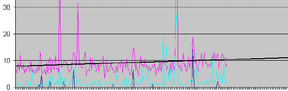
The new created
chart will now appear on your screen. See mine below.

If you are new to
Microsoft Excel charting, you may not like what you see. Generally, the
biggest mistake novices make is to put too much data on the chart,
which makes it hard to analyze. If you don’t like your chart, at
least it is easy to start over. Also, you can modify your chart
using Excel’s many chart editing tools. One of the most common
things you might want to change about a chart’s appearance,
after creating it, is the X- and Y-axis’s scale or labeling.
This is because the default scale and labeling created by the
Microsoft Excel Chart Wizard isn’t always the best.
Since this
tutorial is not how to use Microsoft Excel’s graphing feature,
we are done looking at how to graph Performance Monitor data. If
you want to learn more, use Microsoft Excel’s online help to
learn how you can "dress-up" your charts for
presentations to your boss.
Now that we have
our chart, how do we interpret it? As I have mentioned earlier, we
will be saving this to part four of this four part tutorial on
Performance Monitor. But until them, the most obvious place to start is
to look at the relationship among the various counters and time.
What you are looking for are trends, patterns, or anything that
looks out of the ordinary.
How
to Do Trend Analysis on Performance Monitor Data
In the previous
section we looked at analyzing historical data. In this section,
what we are going to be doing is to take this same historical data and
project it into the future.
Why? As
a DBA, it is our responsibility to plan for the future, letting
our bosses know that we are running out of disk space, or that
we will soon need to add an extra CPU to the server. While we
often don’t need fancy charts and analysis to know the answers
to these questions, we often have to make a case for our
recommendations. And one of the most effective way to present
your case is to project current trends into the immediate
future.
This can provide the best "hard facts" you
have available to make your case. If you can show on paper that
you have made a substantial effort to analyze the data, and that
the data proves your case, then it will be much easier to get
the added hardware you need to keep your server’s running at
optimum performance.
While
the Performance Monitor’s Chart mode provides very similar
results as Microsoft Excel (as we saw earlier in this article),
what Performance Monitor cannot do is project data into the
future. This is where the real power of Microsoft Excel comes
into play.
How
Can Microsoft Excel Project the Future?
Microsoft
Excel provides a number of statistical techniques to take
historical data and project it into the future. Each of the
techniques provided by Microsoft Excel for projecting the future
has their own pros and cons. Since this is not an article on
trend analysis and forecasting, we won’t discuss all the
possible options. What I am going to do is show you how how to
perform a very common and simple analysis called linear
regression. You may remember if from you school math classes.
And don’t worry, you don’t have to remember any math, Microsoft
Excel will do most of the work for you. Of course, if you like
math, then you may want to get fancy and check out some of
Microsoft’s Excel’s other statistical techniques.
Before
You Begin
Microsoft
Excel offers two main ways to perform trend analysis, either
through the use of statistical functions (such as TREND), or by
using charts. Now you know why I introduced you to Microsoft
Excel Charting in the previous section. We are going to keep our
trend analysis as simple as possible, and we are going to create trendlines using
the charts I showed you how to create earlier.
The
first step to performing trend analysis with Microsoft Excel is
to create a chart based on the data you want to project, similar
to how we described above. But when it comes to projecting the
future based on historical data, the more historical data we
have, the more accurate our projections will be. While is is
possible to only use a week’s worth of data and use it to
project the future, the results wouldn’t be very accurate.
Generally, I prefer to have at least three months of historical
data before I perform any trend analysis. The more historical
data I have, the better the projections will be.
Another
issue, which has already been briefly discussed, is how granular
should your data be? At the very most, I would want the data
being projected to be based on hourly averages. The more
granular the data, the more information Microsoft Excel has to better
project the future. But the more granular the data, the more
data you have to work with, which can be a hassle in Microsoft
Excel as it has a finite number of rows and columns.
Also
keep in mind that the historical data you will be analyzing must
represent the typical data of your day-to-day
production of your SQL Servers. If the data you have includes
non-standard data (such as data that came from a one-time test),
you don’t want to include that data along with the rest of your
data. Also, the historical data must be contiguous, it must not
include any gaps, such as a missing a day here and there. It is important to gather performance monitor
data on a regular basis and store it in one central location,
otherwise, performing trend analysis is difficult, if not
impossible.
Also
keep in mind that you can’t project into the future too much, as
there are just too many unknowns. Generally, I prefer not to
perform trend analysis for a time period greater than one half
of the time covered by my historical data. For example, If I
have three months of historical data, I don’t generally try to
project more than six weeks into the future. If I have six
months of historical data, then I can project about three
months ahead, and so on.
Now if you have a good background in
statistics, you may cringe over my recommendations. But my goal
here is not be be "statistically correct", but to
provide a relatively simple way to identify trends and to see
what might happen in the immediate future assuming the trends
were not to change. If you want to be "statistically
correct", you always have that option. But if you are like
most DBA, statistics is not your specialty, so I am keeping
things simple here.
How
to Use Microsoft Excel to Perform Trend Analysis
Once
you have determined which data you want to analyze and have
exported it into Microsoft Excel, your first job is to create a
chart as we described earlier in this article. To create a
trendline for any of the counters you are tracking (you have to
create a separate trendline for each counter), follow these
steps:
-
Display the
chart containing your historical data. The bigger you can
display the chart on the screen, the easier it will be to
use.
-
Select the
counter you want to create a timeline for by clicking it
with your right mouse button, then select "Add
trendline" from the dropdown menu.
-
In the
"Add Trendline" screen, you have the option of
selecting the type of trendline you want to create. Unless
you are an expert on statistics and know the meaning of each
option, stick with the default choice of "Linear".
-
Now, click on
the "Options" tab of the "Add Trendline"
screen. Here, under "Forecast", you want to enter
the number of time periods you want to project into the
future. Time periods refers to the time interval for your
historical data. For example, if your time period is one
hour, and you want to project one month into the future, you
would enter 720 (30×24).
-
When you are
done, click on "OK", and the trendline is created
for you automatically in your chart. See figure below.
You
can repeat these steps for each of the counters in your graph,
looking for potential trends. Not all counters will indicate a
trend, while others will have very obvious trends. Keep in mind
that the quality of your trend analysis projections is based on
the quality of the historical data you are feeding it. It is
sometimes a little to easy to accept the results created by
Microsoft Excel because the results "look" so good.
But we all know the old adage, "garbage in, garbage
out."
As
you can see, performing trend analysis on Performance Monitor
data is relatively easy, once your historical data is imported into
Microsoft Excel and it has been put into a chart. As a beginner,
you will want to do a lot of experimenting to get charts that
look great for presentations. And if you are a statistics
expert, you can perform many others types of trend analysis.
Use Pivot Tables to Analyze Performance Monitor Data
Another powerful
way to use Microsoft Excel to analyze your Performance Monitor
Data is to use pivot tables. A pivot table is an interactive
table that allows you to quickly filter, summarize or
cross-tabulate data. A pivot table can be created from a
Microsoft Excel table, or it can be created directly from a SQL
Server table using Microsoft Excel’s ability to access an
external data source using a DSN.
In
this section, I will introduce you to the basics steps of how
you might use pivot tables to analyze Performance Monitor data.
What I won’t do is provide you step-by-step details, as this
would add several thousand words to this already long article.
If you are new to pivot tables, you can learn more about them
from Microsoft Excel’s online help.
Use
Pivot Tables to Aggregate SQL Server Performance Monitor Data
While
pivot tables offer many options for summarizing and analyzing
data, one of the most useful features of pivot tables is to
aggregate your Performance Monitor counter data. For example,
say that you collect Performance Monitor data every minute, but
that you want to aggregate the data by the hour to make it
easier for you to perform long-term trend analysis. One option would be
to aggregate the data when you move it from SQL Server to
Microsoft Excel using DTS. But if you don’t want to aggregate
your data using DTS, you can perform the same task using a pivot
table. Here are the basic steps:
-
The first step
is to decide if you want to first export your data to Excel
from SQL Server using DTS,
then create the pivot table based on this data, or if you
want to directly import the data from SQL Server using
Microsoft’s data access capability. For this example, I will
assume you will export the data from SQL Server to Microsoft
Excel using DTS as described earlier in this article. Keep
in mind that Microsoft Excel has a finite amount of space to
hold data, so don’t send over too much data to Microsoft
Excel.
-
When importing
the data from SQL Server, I generally only bring over at
least two columns of data: the "time"
column and at least one counter column. Also, be sure
that the "Time" column is brought over in a
DATETIME data type, not a VARCHAR data type. If the
"time" column is not in a DATETIME format, then
the pivot table won’t be able to aggregate the times for
you.
-
Once you have
imported the data into an Excel spreadsheet, the next step
is to run the Pivot Table Wizard, which is started by
selecting Data|PivotTable Report from the Microsoft Excel
drop-down menu.
-
In screen 1 of
the Pivot Table Wizard, you must specify where the data is
you want to analyze. Since our example is using data from a
Microsoft Excel spreadsheet, select "Microsoft Excel
list or database". Click "Next" to continue.
-
In screen 2 of
the Pivot Table Wizard, you must select the data from the
Microsoft Excel spreadsheet that will be added to the pivot
table. The Wizard will try to guess what data you want in
your pivot table. If it guesses incorrectly, you can select it
yourself by clicking and dragging the data on the
spreadsheet. Click "Next" to continue.
-
Screen 3 of
the Pivot Table Wizard is the most difficult to understand
by most beginners. What you do here is to drag the column
names (at the right of the screen) and place them on the
Pivot Table (on the left of the screen). You do this by
clicking on the column name, and then dragging the column
name to the part of the pivot table where it belongs.
Generally, you will want to drag your "time"
column to the "row" part of the pivot table, and
drag the counter column names to the "data" part of
the pivot table. To keep things simple, I only
drag one counter column name to the "data" part of
the pivot table. Click "Next" to continue.
-
Screen 4 of
the Pivot Table Wizard is the last screen, and all you have
to do is tell the Wizard where you want to the pivot table
to be created. Most often, select "New worksheet".
Then click "Finish", and the pivot table will be
created in a new worksheet.
-
The pivot
table is now created, but we are not done yet. Our goal is
to aggregate the data into larger time intervals. Once we
have done this, we can use our data to create a chart and
then perform trend analysis on it, like described earlier in
this article. Now let’s take a look at the two steps
required to aggregate our data.
-
The first step
is to select all of the cells in the pivot table for the
counter you want to aggregate. Do this by clicking and
dragging. Once all the cells are selected, right-click on
any of the selected cells and select "Field" from
the menu. This displays the Pivot Table Field screen.
From here, click on "Average" from the
"Summarize by" list box, then click
"OK". Once you have done this it will appear as if
nothing has happened. It has, but you won’t see it until the
next step.
-
The second,
and final step, is to first select the "Time"
column by clicking on the "Time" column heading on
the pivot table. Next, select Data|Group and Outline|Group
from the drop-down menu. This displays the Grouping screen.
Here, select how you want to aggregate your data. You can
choose grouping by Seconds, Minutes, Hours (the most useful), Days,
Quarters, and Years, then click on "OK".
Finally, you are
done. The pivot table should now show an aggregation of your
counter data, averaged over the time period you specified. At
this point, you can then chart the data using the Microsoft
Excel Chart Wizard, and then add a trendline as described
earlier.
This
is Just the Beginning
While this article
is long, it just barely touches the surface of what you can do
with Microsoft Excel. If what you have found here is of
interest, I suggest you take some time and experiment. If you
are new to Microsoft Excel, then I suggest you get a good book
on it, or take a class. While Microsoft Excel is not a perfect
tool, it provides a lot of power if you learn how to take
advantage of it.
Stay
Tuned for Part Three
In the next
installment (part four of four parts), we will take a look at
how to interpret SQL Server Performance counters data. Check
back in September for part four.