New with SQL Server 2008 R2, PowerPivot is an extension of Analytical
Services providing power users with a familiar tool for analyzing massive
amounts of data from disparate sources (including web and data feeds).
PowerPivot comes in two flavors: PowerPivot for Excel and PowerPivot for
Sharepoint. This article gets you started with PowerPivot for Excel.
Installing PowerPivot
The PowerPivot plugin for Excel can be downloaded from the
official PowerPivot site: www.powerpivot.com.
PowerPivot can be installed on both x86 and x64 systems
including Windows XP sp3, Windows Vista sp1, and Windows 7. If you aren’t installing
it on Windows 7, you will need to install .Net Framework 3.5 SP1.
A minimum of 1G of memory is required to run PowerPivot, but
2G is recommended. Depending on the solution, more memory for PowerPivot can
increase the performance of the transformations due to its in-memory processing
capabilities.
Also on the PowerPivot site is a link to a trial for
Microsoft Office 2010 Professional Plus if you don’t already have it installed.
If you customize the installation of the Office Suite, you need to choose at
least Excel and the Office Shared Tools.
Once Microsoft Office is installed, you can download the
PowerPivot install from the download page on the PowerPivot site. Locate and
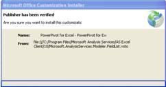
click on the PowerPivot install file. The add-in will actually install the next
time you run Excel, at which time you will be asked to approve the installation
of the PowerPivot add-in.
Creating Your First PowerPivot
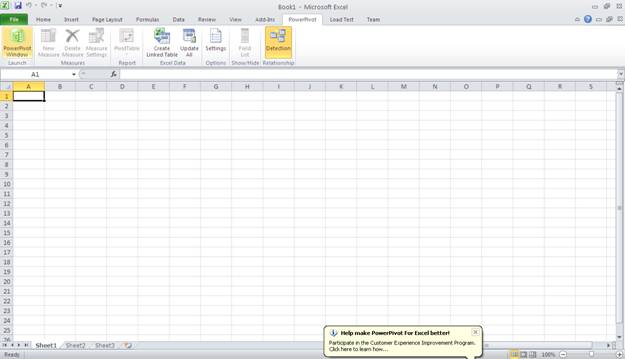
Now that the PowerPivot add-in is installed, you can see
that you have a new PowerPivot tab across the top of Excel. Clicking on that
tab displays the PowerPivot ribbon. To select the data to use for your
PowerPivot, you will need to click on the PowerPivot Window button (highlighted
on the left below).
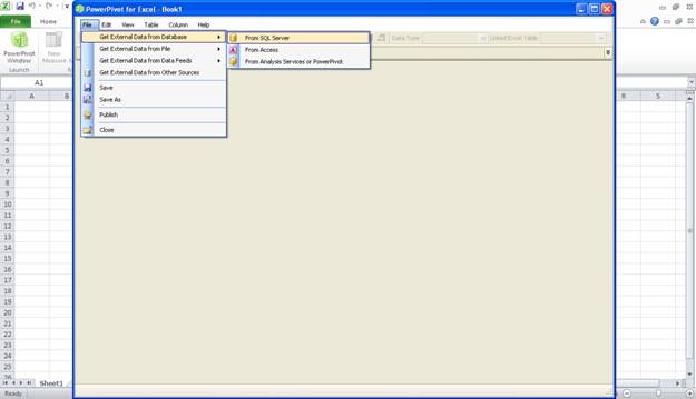
On the PowerPivot window, select Get External Data from
Database -> From SQL Server. Notice that you can also get data from many
other sources including data feeds, text files, and the web. In this case,
however, we are going to use the AdventureWorks2008DW sample database.
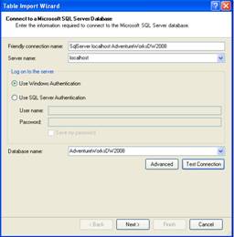
In the Table Import Wizard, specify localhost for the server
and AdventureWorks2008DW as the Database name. If you need to install
AdventureWorks2008DW, you can find it here.
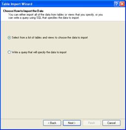
Hit Next and make sure to select “Select from a list of
tables and views to choose the data to import” from the next screen.
From the table list, select the FactResellerSales table and
rename it to ResellerSales in the Friendly Name column.
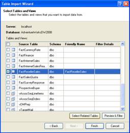
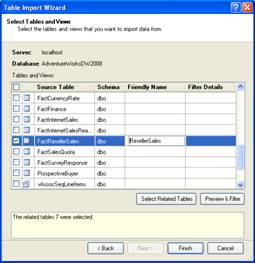
While you are there, click the Select Related Tables
button. This selects the 7 tables in the database that have a relationship
with the FactResellerSales table. Click Preview & Filter just to have a
look; we won’t change anything here, though you could use it to filter out rows
and columns from the model.
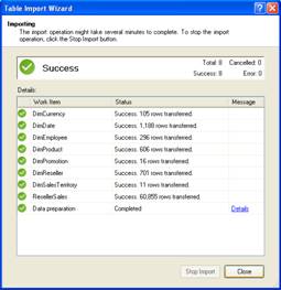
Click Cancel to get out of Preview & Filter and then hit
Finish on the Table Import Wizard screen. This brings up the following window
which displays the progress on each table import.
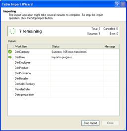
A Details link displays in the message column on each import
line if there is information or errors regarding the import. Notice there is a
detail link on final step, data preparation. Clicking that displays a popup
window with information about the data preparation. Most of it is successful,
but it does inform you of a few errors. For instance, self-joins are not
supported in the case of employee. Fortunately, none of these affect the pivot
we are creating.
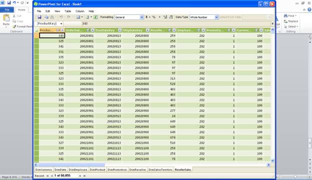
Closing the Table Import Wizard reveals the model from which
we will work. First, let’s tweak a few things. You see each imported table is
represented on its own tab in the model. Let’s select the ResellerSales tab.
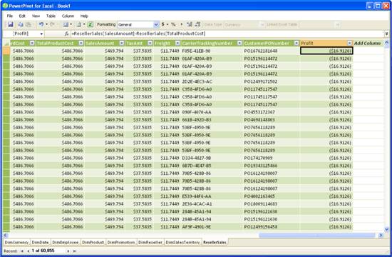
Scroll all the way to the right and click on “Add Column” in
the header. For the expression, subtract TotalProductCost from SalesAmount.
You can either type in the expression as it appears below, or build it as you
click the columns.
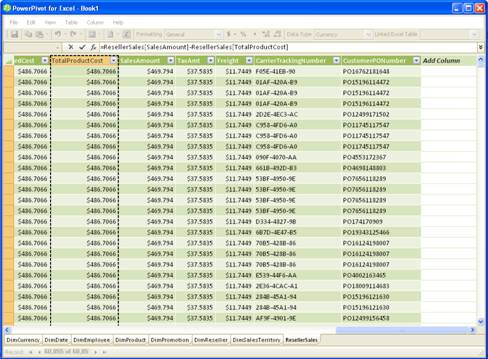
Now we need to give our new computed column a better name
than ComputedColumn1. Right-click on the column header and select “Rename
Column” from the drop down menu. Change the name to “Profit”.
To get started on the Pivot Table, we need to switch back to
the workbook itself. You can either just click on the spreadsheet in the background
or you can use the toolbar button that looks like the Excel icon (next to
Formatting) to switch back.
Once back in the workbook, select the PivotTable button and
choose Chart and Table (Horizontal) from the menu. This allows you to create both
a chart and table for your data contained on one table. The chart will be on
the left and data will be on the right.
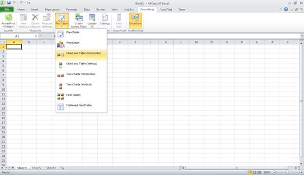
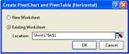
When asked for a decision on placing it in a new or existing
workbook, choose the existing workbook.
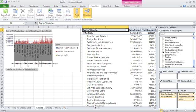
The Field List panel on your right controls the contents of
the pivot. Let’s begin by dragging the fields we are interested in from the
list into their respective areas. First drag the amount fields for
TotalProcuctCost, SalesAmount, and Profit from the ResellerSales table down to
the Values list. Drag the SalesTerritoryRegion from DimSalesTerritory to the
Row Labels list. Similarly, drag the ResellerName column from the DimReseller
table down to the Row Labels list and drop it in below the SalesTerritoryRegion
column.
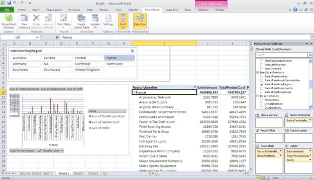
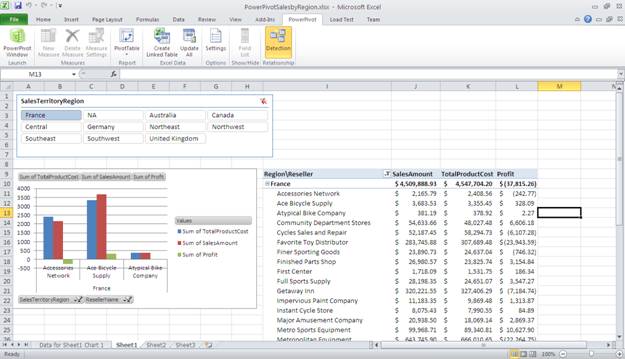
Now that the report is filled in, we’ll clean it up a
little. Change the header “Row Labels” to “Region\Reseller”. Change the
headers over the three amount fields to remove “Sum of” from the name. Your
pivot report and Field List panel should resemble the following screen shot.
It’s starting to look good, but the chart is way too busy.
Maybe we should just look at one region at a time. So let’s add a horizontal
slicer. From the Field List, choose SalesTerritoryRegion again and drag it to
the Slicers Horizontal list. Now you see a button for each region displayed at
the top of the report. Click on France. You’ll see the report and chart
filter down to display just the region of France and its resellers.
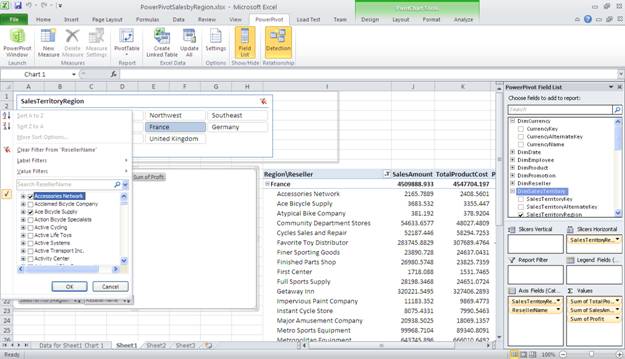
Let’s further narrow down the chart by doing a manual filter
using the filter button on the chart for ResellerName. From the list, first
click Select All to unselect all the resellers, then pick just Accessories
Network, Ace Bicycle Supply, and Atypical Bike Company. This reduces the Resellers
displayed on the chart to just these three. Note that if we would have
selected resellers not from France (our existing Region filter), the chart
would be empty.
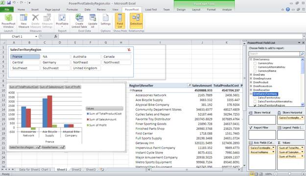
The resulting chart is much easier to read having just the
three resellers of interest graphed.
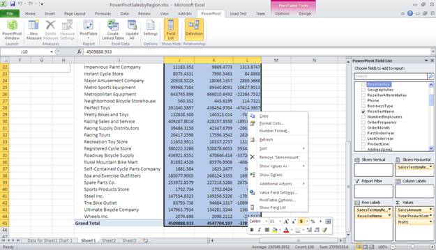
We are not quite done. It’s bothering me that our amounts
have more than 2 decimal places, so let’s take care of that real quick. Select
all the data for the three amount columns and when the formatting menu appears,
select the $ icon as shown below.
And now, the final product. Congratulations on completing
your first PowerPivot report.
Conclusion
Hopefully you found it quite easy to create your first
PowerPivot. Explore the other options for data sources and PowerPivot
reports. There is so much more you can you can do with this powerful analytical add-in for Excel.
»
See All Articles by Columnist
Deanna Dicken


