


Introduction
SQL Server Reporting Services allows you to embed indicators and Gauges in your report to analyze the data and its state. Indicators are minimal gauges that convey the state of a single data value at a glance and are mostly used to represent state value of Key Performance Indicator (KPI).
In my last article (Creating Indicator and Gauge in SSRS – SQL Server 2008 R2 – Part 1), we discussed the details of Indicator and Gauge, and created a step-by-step tablix report with two levels of grouping, which we will be using in this article to add different types of indicators and gauges to it.
Adding Indicators to the Tabular/Tablix Report
Since we are done with creating the SSRS project, the Report, the Data Source and Dataset, and a product sale report grouped on product subcategory and product category, the next step is to add an Indicator in the report. To add an Indicator to your report, go to Toolbox and under the Report Items pane you will see the Indicator icon as shown below; drag it to the report designer area and add it to the another column on the report table.
Toolbox
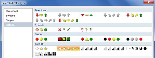
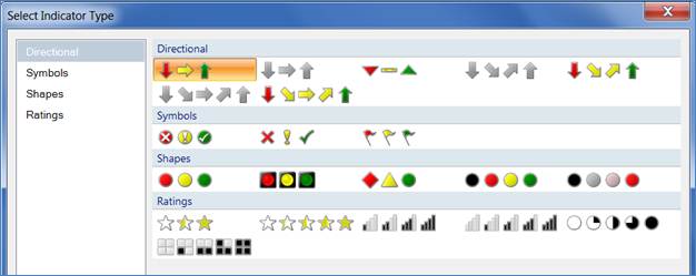
Dragging an indicator to report designer will bring up a dialog box where you need to choose the type of indicator that you want to add to your report. There are several indicator types to choose from like Directional, Symbols, Shapes and Ratings and you can customize them all with different colors (other than their default color), and can even choose your own image to be shown in place of the built-in image:
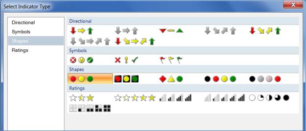
Select Indicator Type
In my case I wanted to choose an indicator of type ‘shapes,’ which will tell me how the sale of one particular product is doing in comparison with other products in the same subcategory, and how a category of products is doing in comparison with other categories of the product. To specify that, right click on the indicator and click on the “Indicator Properties” menu as shown below.
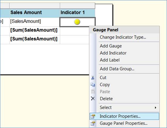
Indicator Properties
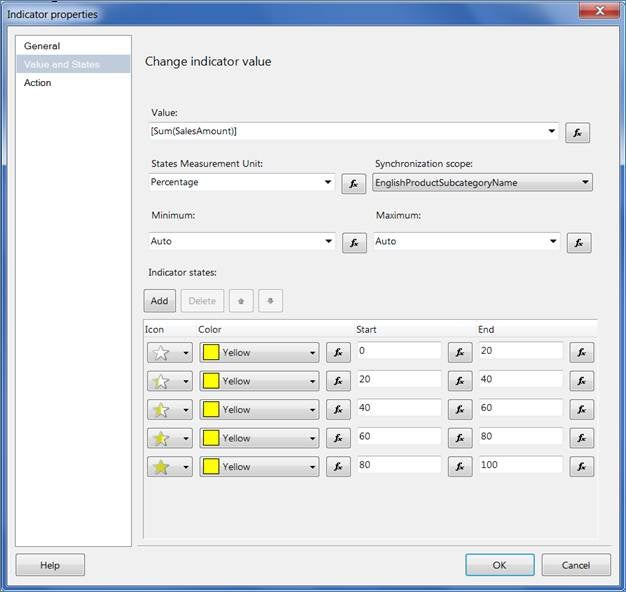
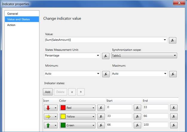
On the “Indicator Properties” dialog box, go to the “Value and States” page; choose the value based on the state that will be decided. (In my case I wanted it to be a summation of the sale amount for each product). Next specify the “States Measurement Unit,” which can be either Percentage or Numeric; if you choose Percentage then you also need to specify the synchronization scope. As I said before, I wanted to display how each product sale was doing in comparison with other products in the same subcategories and hence I have defined to show the Red icon if the sale falls between 0-33, Yellow icon if it falls 33-66 and Green if it falls 66-100, with respect to the highest sale of any specific product in that product’s subcategories. (You can also specify the minimum and maximum scale for the comparison rather than using the Auto option):
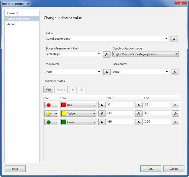
Change Indicator Value
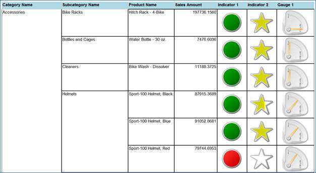
Below you can see the different colors of indicator, indicating comparison with respect to others and making analysis easier now.
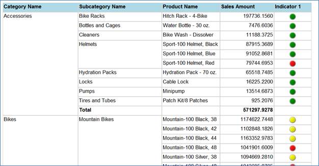
Indicator Comparison
Let’s add another indicator of a different type. Create another column in the table on the right side, go to the Report Items pane, drag Indicator to the new column and this time choose the Ratings type as shown below.
Select Indicator Type
This time I also I want to analyze percentage of summation of product sale and give ratings with the synchronization scope of product subcategory:
Indicator Properties: Value and State
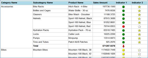
You can see the rating of each product sale on the basis of summation of each product sale in the scope of product subcategories:
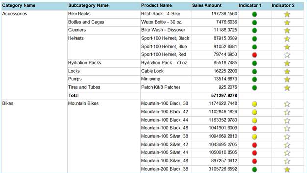
Summation of each product sale in the scope of product subcategories
So far so good. Let’s now add an indicator to analyze how total product categories sale is doing in comparison of other product categories sale within the scope of the tablix. Again, drag an Indicator from the Report Items pane and place it in the row that shows the total sales value for each product category.
Select Indicator Type
This time I have chosen direction icons to represent states. I have specified to show a red icon if the sale falls between 0-33, yellow icon if it falls 33-66 and green if it falls beteen 66-100 with respect to the highest sale of any specific product categories in that tablix report; if you notice this time I have chosen Tablix as synchronization scope:
Indicator Properties
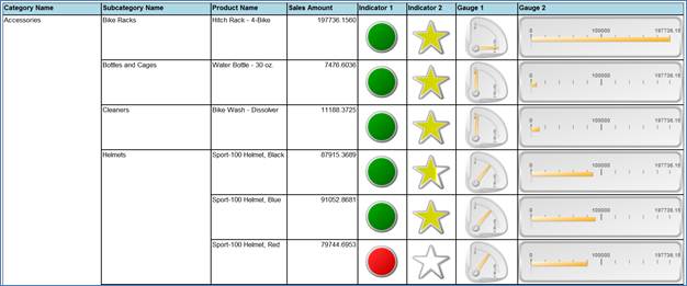
Notice the directional icon representing state of the total product category sale. If you notice, even though most of the products have a green icon for the Accessories product type, yet the total product category sale is shown as a red icon. The reason is, in the first case it shows the state of product sale with respect to other products in the same sub categories whereas in the latter case it shows the state for total sale for each product category with respect to the sale of other product categories and in this case the total sale for Accessories product categories falls between 0-33 percentage with respect to the total sale of other product categories; hence it has been shown as a red icon.
Summation of each product sale
Adding Gauges to the Tabular Report
Though Indicator and Gauge look different (an indicator is a minimal or simple gauge only), they both display single data value but the key difference is gauge has elements, like frames and pointers, whereas the indicator has states, icons or/and labels but essentially indicator states are similar to gauge ranges only.
Now let’s add a gauge to the report that we created earlier. First create a column on the right side in the tablix and next drag a Gauge icon from the Report Items pane to the newly created column. This will bring up a dialog box as shown below; here you need to choose from either radial or linear gauge type or one of the different varieties in each type.
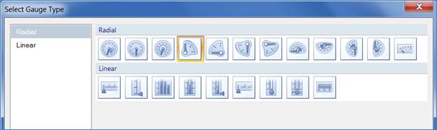
Select Gauge Type
Dragging a gauge is not enough; we also need to specify the value that will be represented by this gauge. Select the gauge, and specify the value to be analyzed in the Gauge Data pane; as you can see in my case I have chosen summation of product sale amount:
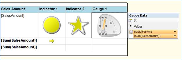
Gauge Data Pane
Now select the pointer, right click on it and then click <Gauge Type> Pointer Properties. On the properties page specify pointer type, needle style, placement and size options and several other properties as required.
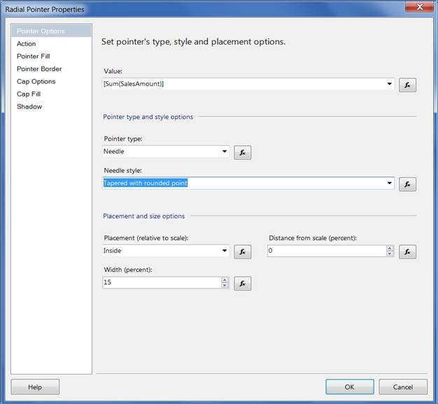
Radial Pinter Properties
Now let’s preview the report with added gauge:
Report with added gauge
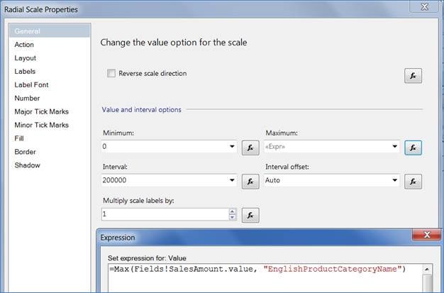
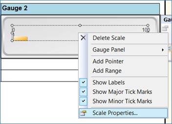
Now let’s customize the scale of the gauge. To do that select the scale in the gauge, right click on it and then click on the Scale Properties menu as shown below.
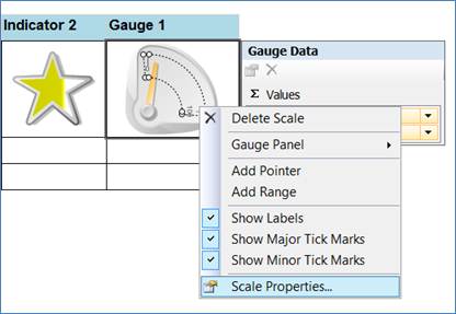
Scale Properties
On the Scale Properties dialog box, I have specified zero as the minimum value and the highest product sale within each product subcategories for maximum (with the expression as specified below); also I have specified 200000 as the scale interval for readability.
=Max(Fields!SalesAmount.value, "EnglishProductCategoryName")
Radial Scale Properties
Now let’s add another gauge of a different type than the earlier one to the report. To do that, again add a column in the right of the tablix and drag Gauge from the Report Items pane; on the dialog box select the one from Linear type as shown below.
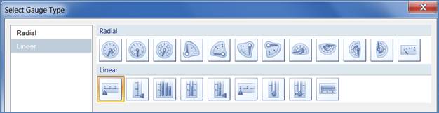
Select Gauge Type
In the new gauge, select the scale, right click on it and click on Scale Properties as shown below.
Scale Properties
Again I have specified similar values to what I specified for the earlier gauge; this time I have kept the interval as 100000 for better readability.
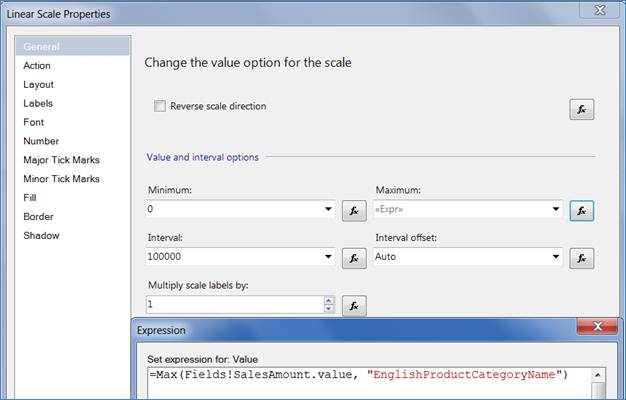
Linear Scale Properties
Next select the pointer, right click on it and click on Pointer Properties as shown below.
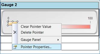
Gauge 2: Pointer Properties
On the Pointer Properties page, first specify the value this pointer will represent, and several other properties like pointer type, placement and size options as per your need and requirement.
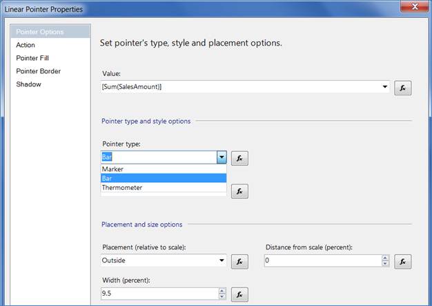
Linear Pointer Properties
That’s all, now let’s preview the report again and here is how it will look like:
Preview the report
Conclusion
SQL Server Reporting Services allows you to embed Indicators and Gauges in your report to analyze the data and its state. Indicators are minimal gauges that convey the state of a single data value at a glance and is mostly used to represent state value of Key Performance Indicator (KPI). In this article, we discussed how you can utilize this feature and enhancement to make your report look more intuitive and informative to the business users.
Resources
Gauges (Report Builder 3.0 and SSRS)